Where's the picture?
Well, it's been a great Christmas and
New Year's holiday at the observatory. That would be all except the
clouds and rain. Six inches plus of rain. Finally, on January 5th
I was able to get back under the stars and see them. It was cold,
however. The thermometer on the scope registered 18 degrees F at 9:30
when I came in. Never fear, though; I wasn't out the whole time. I
used the Starlight Network to sit in front of the TV, nice and warm,
while I let the scope, camera, and computer do it's thing; I just
monitored it all. That's my idea of a good way to image. It's taken
only 13 years to get to this point. My patience has been rewarded.
Well, on to the current image, which is IC342 located in the
constellation of Camelopardalis. That's a mouthful. Translation, the
Giraffe. This is not a constellation from ancient Greek times, but
from about 1613. From Wikipedia “Camelopardalis was created by
Petrus Plancius in 1613 to represent the animal Rebecca rode to marry
Isaac in the Bible.[1] One year later, Jakob Bartsch featured it in
his atlas. Johannes Hevelius gave it the official name of
"Camelopardus" or "Camelopardalis" because he saw
the constellation's many faint stars as the spots of a giraffe.[7] “
IC342 is a galaxy, very faint, of course, about 7 to 11 million
light years from earth. This one pushed the scope, which has an 8
inch aperture, pretty much to the limits for my geographical
location. By that, I mean that the skyglow was getting uncomfortably
close to the glow from the galaxy. Allow me to demonstrate.

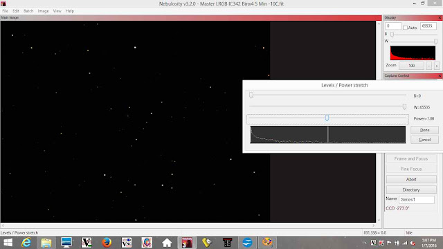
What you see above is the image of the
galaxy after all the calibration frames have been applied and the
luminance, red, green and blue channels have been added together, but
before any level adjustments have been applied. The program I'm
working in is Nebulosity, and this is the work screen shot showing
the image and some information on the image. What you see in the
image section are the foreground stars (those stars between us and
the galaxy).

In the screen shot above, I've
highlighted the histogram. It took me a long while to get used to
working with a histogram, but now it's more or less second nature.
What the histogram shows is the number of pixels of a particular
value. That's rather general, so let's look at this histogram. The
red part of the histogram tells me the relative number of pixels that
have a 0 (zero) value on the far left of the histogram and a value of
37440 on the far right (and everything in between). A pixel of value
0 is a black pixel. As the value of a pixel increases, in becomes
brighter white, so to speak. From this histogram, we can see that
there is a lot of pixels nearer to 0 than 37440. As is the case with
most images of the night sky, that's what we would expect; there's a
lot more black than white. I can also tell that, if the image
of the galaxy exists, it's in the group of pixels at the far left
end. Another way of looking at it, no pun intended.....well, maybe,
is that the information I want to show is in the group of pixels at
the far left end. My goal, will be to use the image tools in
Nebulosity to spread the small range of values at the far left end
out, and into as wide of a range as I can and still have the image
look reasonable. Whatever the final range of values, what I want is
to see the histogram look as nearly flat, like the top of a cake, as
I can get it, instead of seeing a histogram with the graph looking
like it does now, with a sharp peak at the left side and little on
the right.
What I've done is bring up the “levels”
adjust dialog box. Notice that the graph there is essentially
identical to the histogram in the upper right corner. What I will do
is make a series of changes in the "levels" dialog and show
the results. Follow along, if you want.
Notice that I've move the “power”
slider to the left and the result in the image is that it is now
lighter, like turning up the brightness.
Now I've closed the original "levels"
dialog box, opened another and moved the black slider to the right.
See how the image is now a little darker than the previous one, but,
more importantly, the graph (both the histogram and the one in the
"levels" dialog box) are starting to spread out. It will
never be completely flat, but lets see what we can do.
I've done exactly the same thing (ie,
opening a "levels" dialog box, moving the power slider to
the left, closing, opening a new "levels" dialog box,
moving the black slider to the right) 2 more times. As you can see,
the histogram is much flatter, and the galaxy is starting to emerge
from the background.
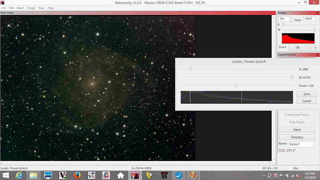
I've done exactly the same thing (ie,
opening a "levels" dialog box, moving the power slider to
the left, closing, opening a new "levels" dialog box,
moving the black slider to the right) 2 more times. The galaxy is
clearly there, but looks rather rough. That's about all I can do with
the histogram for now. What happens next will be something like...
blur the image (the noise in the image is less organized than the
galaxy, so blurring will help to get rid of it when I sharpen the
image.), then sharpen, remove any residual background color problems
(color cast), increase contrast, and so on until I'm happy with the
image. After all that, the best I think I can get from this image
looks like:
I hope you enjoyed the journey.


